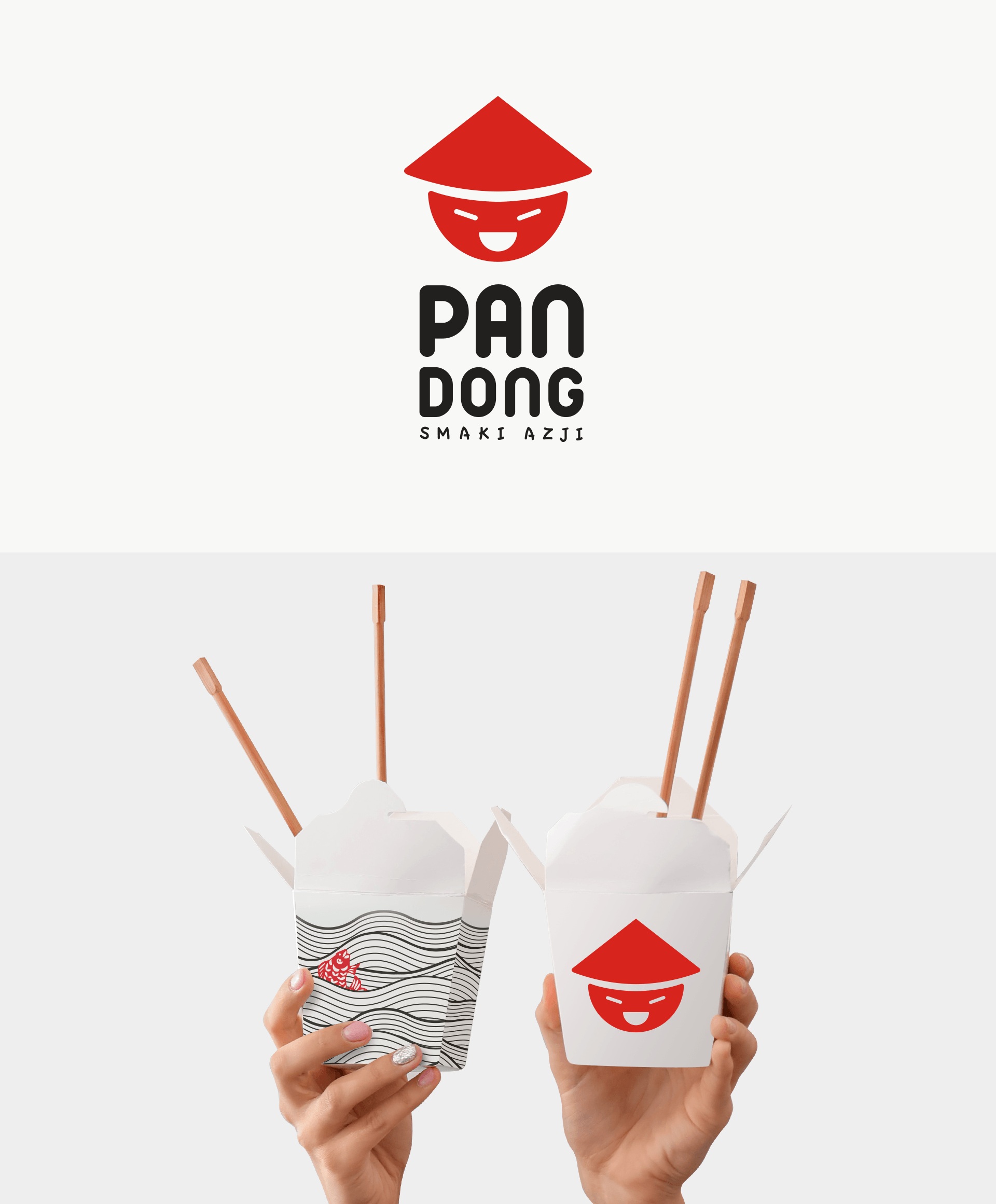
PAN DONG
A concept project for the visual identity of the Far East fast food restaurant
The core idea of the project was to provide a visual identity which is modern, neat but also very light and with a positive vibe. The aim was to present a fast food restaurant as a friendly place with low prices but good quality of food and service.
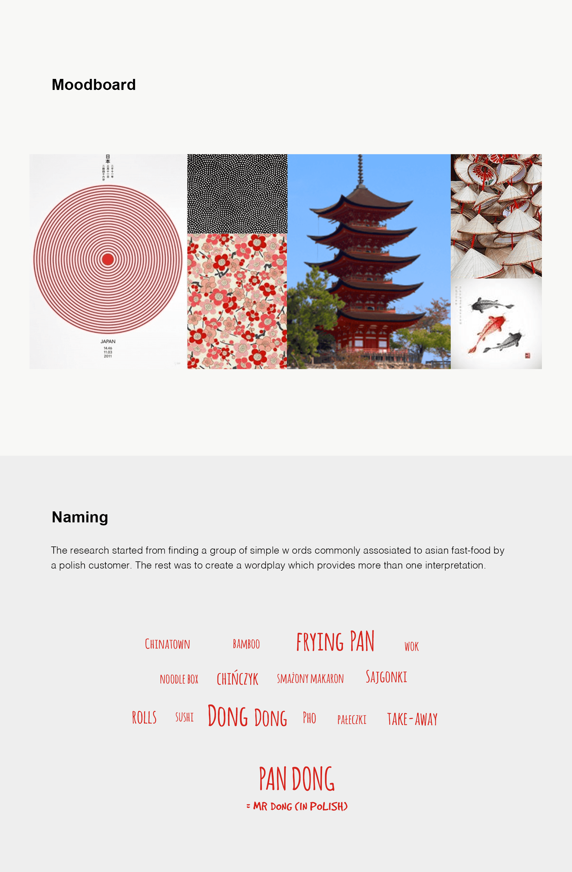
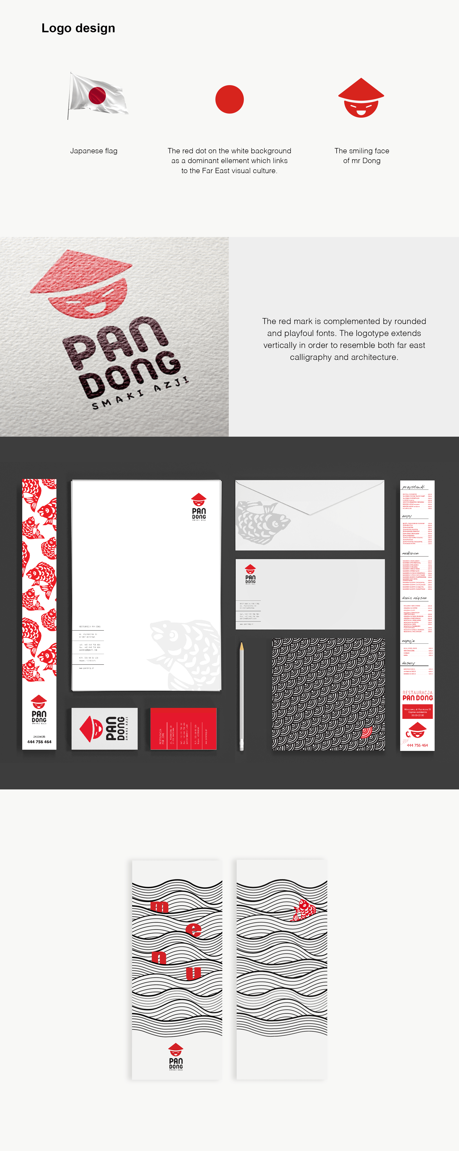
The first step was to find a proper name which would reflect those ideas, also to be an introduction for the ‘visual story’ narrated by the whole project. Starting with the basic words which are commonly associated with Far East food I created a ‘Pan Dong’. This is a humorous wordplay which twists Polish and English interpretations of those words. The translation from Polish sounds: ‘Mr Dong’.
Mr Dong was illustrated in the restaurant’s logo and became a brand mascot.
The visual part of the project strongly refers to the images of Far East present in pop culture for e.g. scales of carp. The very simple, flat drawings are a game of black and white forms with the strong red accents. The whole project remains easy to read and memorable.